By Mike Loughrin, CEO for Transformance Advisors
Common Data Visualization Technique
Pie charts are one of the most common data visualization techniques. They can quickly show the relative size of different segments or categories of data.
Their power comes from showing how the whole pie is comprised of slices. The key point is having the “whole pie” and carving it into “slices”. Showing how customers, suppliers, products, employees, investments, or millions of other topics are divided into slices can be very revealing and lead to better decisions. Making a “call to action” based upon easy to understand charts is the mission of many data visualization wizards.
However, pie charts will not work for everything. A great chart will “pop” off the screen and immediately announce there is something important to see. Alternatively, working with the wrong data will be frustrating and lead to a meaningless mess which confuses people.
Let’s explore what it takes to create a great pie chart and what to avoid.

“The greatest value of a picture is when it forces us to notice what we never expected to see.”
– John W. Tukey
Great Pie Charts
A great pie chart is a visual wonder which is immediately understood by the viewer. It is not confusing or unpleasant to look at. There are four characteristics for make a great pie:
- The whole pie
- 3 to 6 slices
- Colorful
- Reveals information
Creating a great pie chart is easier said than done. Let’s look closer at each of the 4 characteristics:

1. The Whole Pie
The total of the data you are using should mean something:
- The total revenue from your customers in the United States
- The total expenses for your suppliers in China
- The total amount of all insurance claims for Florida
- The total payroll expenses for all of your employees
- The total amount of your retirement savings
Of course you can work with segments of most anything. If you are making a report about one product line, then make sure you have the total data for that product line. If you are preparing a presentation for emergency room visits, then make sure you have the total visits to the emergency room. The spirit of having the whole pie is about having a grand total which makes sense and does not confuse your viewer. Summing up the salaries of your employees gives you a total amount which could then be sliced into categories. Summing up the ages of your employees would give you nonsense.
Think about the title of your pie chart. It should be very easy to understand and not need a lengthy explanation for what is included or excluded.

2. 3 to 6 Slices
Pie charts become hard to understand if you have too many slices. It would be crazy to create a pie chart on sales by state and have 50 slices. A better approach would be sales by 4 or 5 geographic regions.
The slices of pie is how you bring out the value of your chart. These slices should be different sizes. I’m reminded of my days working at a pizza shop. We always cut the pizza into slices where no two were the same. One of the joys of eating pizza is searching for the slice which has your name on it.
A related caution is how people will not see the difference when one slice is 30% and another slice is 29%. You can help with labels. Alternatively, a ranked bar chart is a better option when your slices are about the same size. Most data visualization wizards avoid pie charts because the viewers perception, of differences between the slices, can become difficult very quickly.

3. Colorful
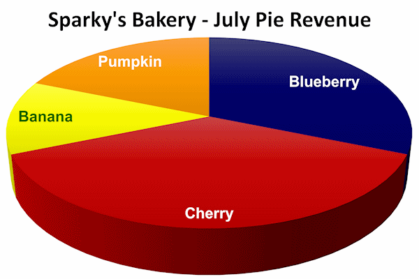
A pie chart should be colorful. Just think about cherry pie, blueberry pie, pumpkin pie, or banana cream pie. Remember how you want your chart to pop off the screen. However, “you should not dance all over the color wheel”, which is an error I tend to commit.
You want your slices to vary in color so they are unique and your viewers can easily see the different slices. Fortunately, the built-in color palettes in most chart making tools will help you look like a pro. Take your time and try a couple of the different color palettes to find the one which looks great.
Once in a while, you might find the need to assign an appropriate color to the various slices. If you are doing a chart on pies, then make the cherry pie red and the pumpkin pie orange. If you are creating a chart on your customers, use the colors associated with their brands. You can do this. So do it!
This entire subject of color in data visualization is beyond the scope of this article. See a few suggestions mentioned at the bottom. I know you don’t have the time. But afterward, you will be glad you did.
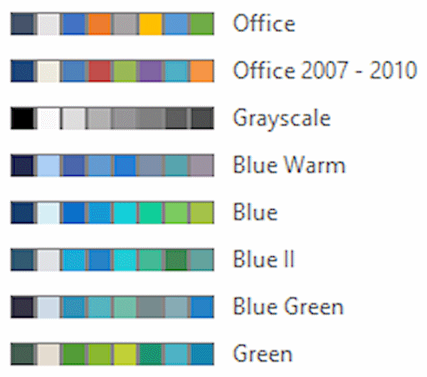
“You should not dance all over the color wheel.”
– Lisa Charlotte Muth, Data Visualization Guru
4. Reveals Information
All data visualizations should be revealing. You don’t want your audience to shrug at your chart and exclaim “so what”.
For a pie chart to be revealing:
- How many slices do we have?
- What is the biggest slice?
- What is the smallest slice?
- What is the relative size of each slice?
A pie chart will often create questions which set the table for the next section of your report or presentation. Think about what you have coming next. If the pie chart sends people off in a different direction, then you are going to be in trouble.

“Great charts enable, inform, and improve decision making.”
– Dante Vitagliano
Frustrating Pie Charts
I have found most articles about pie charts will give a few examples and show wonderful results. However, they all seem to miss a discussion on what not to do. My experience and research reveals you should avoid the following:
- Meaningless or confusing total
- Providing no value
Frustration is sure to follow if you force the wrong data onto a pie chart. Let’s look closer at the 2 areas to avoid:

“I have not failed. I’ve just found 10,000 ways that won’t work.”
– Thomas A. Edison
1. Meaningless or Confusing Total
As discussed, the total of your data equals the whole pie. You should avoid data where the total is meaningless or confusing. A few examples:
- Totaling the lead time for 10,000 raw materials is a meaningless number. The total of these numbers is not your total lead time. It is just the sum of 10,000 items, which does not equal a whole pie.
- Totaling your market share for 20 countries does not mean anything. 5% for Germany plus 5% for Liechtenstein is not 10%. It would be better to use the revenue for each of the 20 countries, then to use the market share of each country. Be very cautious when adding or averaging percentages. See an article on Why You Should be Careful When Averaging Percentages.
- Using data which exceeds 100%, such as 80% of people like apple pie, 60% like pumpkin pie, and 40% like key lime pie. This is similar to the above example on market share and should not be done.
- Limiting your pie to less than 100% of your data will lead to confusion. If your top 3 customers comprise 80% of your total revenue, then a pie chart on just the top 3 customers is not 100%. While it may show the relative size of these customers to each other, it will be very misleading to your audience.
- Using unrelated categories such as monthly salary, value of your house, credit card debt, and mileage on your car leads to a meaningless and confusing total. While this example seems totally insane, I have seen pie charts where the slices are totally unrelated to one another. Don’t do this!
Always look at the total of your slices and verify they are making a whole pie. The slices are different sizes, but they need to be things which add up to 100% of something.

2. Providing No Value
A pie chart should be a colorful and revealing part of any report or presentation. You invest more time into a chart than you do writing a paragraph. And your audience expects a picture to tell a thousand words.
A few examples where you don’t need a chart because there is not much to reveal:
- Your revenue is split 50/50 between products and services. Looking at a pie chart with 2 equal slices is not all that interesting. The fact of a 50/50 split might be important, but it does not need to be done with a chart.
- 98% of your quality defects are due to poor materials from one supplier. While an important statistic, it does not need a pie chart with one huge slice to communicate this fact.
- Your call center tracks 40 reason codes why people call in and each code has about 2% to 3% of the total. A pie chart with 40 slices, all about the same, will not provide value. Grouping the 40 codes into 3 to 6 categories would be a much better alternative.
A pie chart should spark a discussion or lead to the next section of your report or presentation. It should not put people to sleep.

Summary
Pie charts can be a wonderful approach for data visualization. The best ones will “pop” off the screen and quickly reveal important information. Your viewers should exclaim “wow” at what they see.
As with life, there are right ways and wrong ways to craft a pie chart.
The right way will reveal valuable information, and either spark a discussion or set the table for more to come.
The wrong way will lead to frustration for both the creator of the chart and the victim who finds no value in the visualization.
In general, know your data and the story you want to tell. Different types of charts have their unique strengths and weaknesses. Many data visualization experts hold a low opinion of pie charts and favor other approaches such as bar charts, waffle charts, and tree charts. However, pie charts are very common and can be an effective tool.
Those with the courage and perseverance to master the creation of great pie charts will find their data visualization stories come to life.

“Great charts enable, inform, and improve decision making.”
– Dante Vitagliano
Mike Loughrin is the CEO and Founder of Transformance Advisors. He also teaches for Louisiana State University Shreveport and is on the board of directors for the Association for Supply Chain Management Northern Colorado.
Mike brings exceptional experience in industry, consulting services, and education. Mike has helped organizations such as Levi Strauss, Warner Home Video, Lexmark, and Sweetheart Cup.
Keeping a commitment to a balanced life, Mike loves downhill skiing, bicycle rides, and hiking in the mountains. See one of his trails of the month at: Little Switzerland.
Control Charts
Scatter Diagrams
Alternatives to Pie Charts
Recommendation Reports
Complete Guide to Bar Charts
Subscribe to our newsletter
References
A Complete Guide to Pie Charts by Mike Yi
Be Careful When Averaging Percentages by Roberto Reif
How to Pick More Beautiful Colors by Lisa Charlotte Muth
Organizational Improvement Links by Transformance Advisors

